Just when you think you’ve seen it all, MGM releases a trailer–a teaser, but still–for the TITLE of the upcoming James Bond movie.
And that title is, No Time To Die and I don’t think it’s a particularly great one though what interests me more than the title is the font.
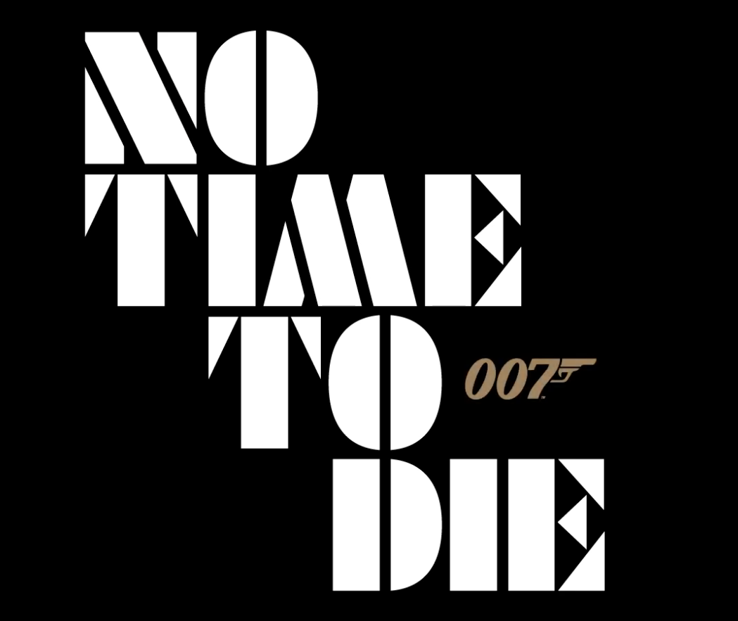
It’s an interesting font that implies to me something futuristic, as opposed to the more grounded tone of movies the Quantum Of Solace (not only a particularly pretentious title, but dumb), Casino Royale and Skyfall.
Though I also get an Anatomy Of A Murder-vibe from it as well though it’s quite unlike any the font used in any Bond film before.
Therefore it’s significant and the only question is “how.”
